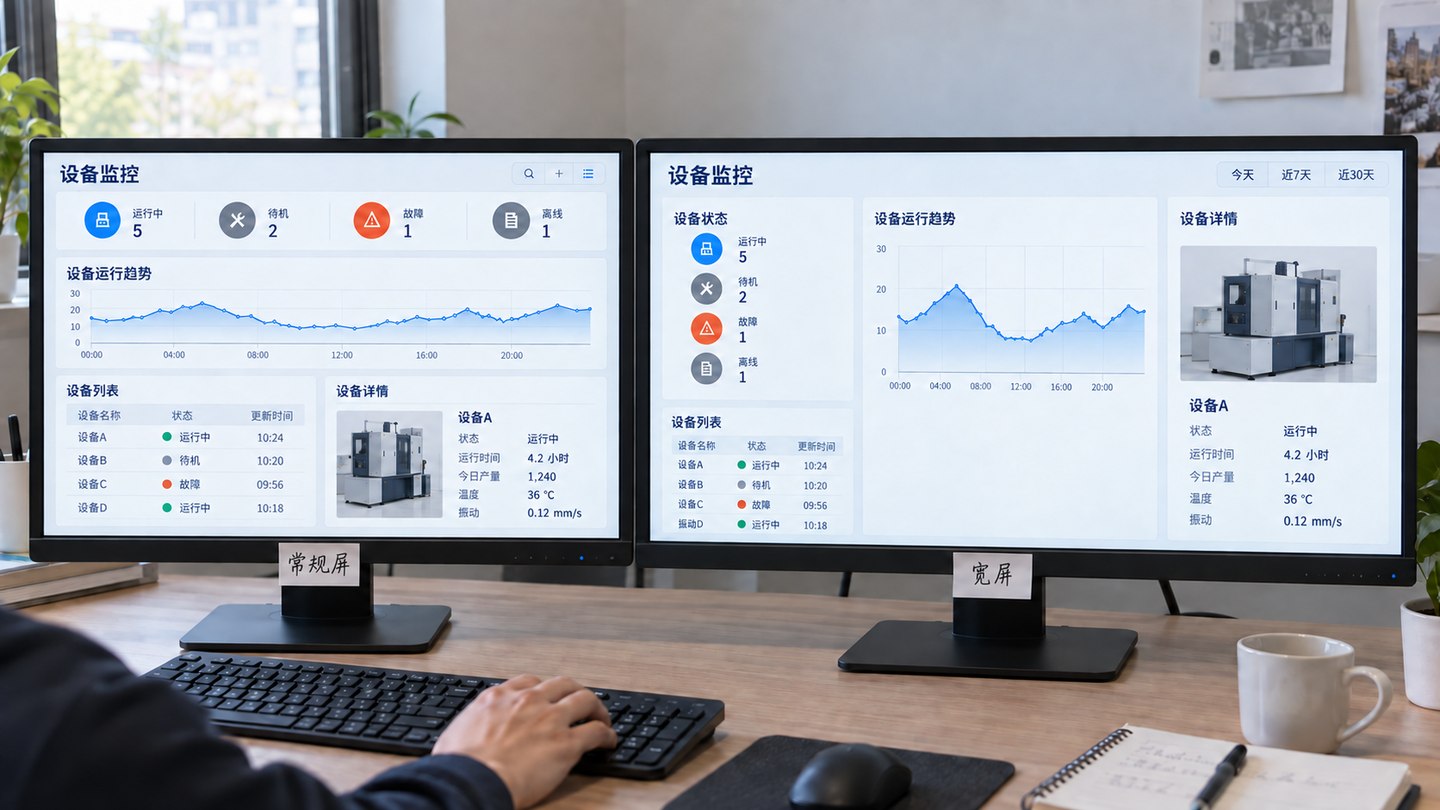
How to Confirm Resolution and Screen Adaptation Before Dashboard UI Design
Summary: “Design for 1920 × 1080” is not enough for dashboard UI work. Before design starts, confirm the physical screen size, actual output resolution, aspect ratio, viewing distance, panel seams, browser and graphics environment, and whether desktop or mobile layouts are also required. Clear inputs reduce the gap between mockups and the installed display.
Confirm the final display environment before choosing the design canvas and adaptation method. Until screen parameters are known, choices about color, type size, and layout are provisional.
Distinguish physical size, resolution, and aspect ratio
A physically large screen does not necessarily have more page pixels. Physical dimensions affect viewing distance and information scale. Output resolution sets the usable pixel space. Aspect ratio controls horizontal and vertical distribution. Confusing them leads to tiny text, stretched charts, empty sides, or cropped content.
When aspect ratio changes, rearrange information blocks. Do not stretch text, circular icons, or charts horizontally. The illustration shows layouts for the same monitoring topic.
Parameter
What to confirm
Impact
Physical dimensions
Screen width and height, mounting height, nearest and farthest viewing positions
Type size, line weight, and area for priority information
Output resolution
Final pixel width and height from the signal source
Design canvas, chart density, and image sharpness
Aspect ratio
16:9, ultrawide, portrait, or irregular format
Page zones and adaptation approach
Panel arrangement
LCD seams, LED cabinets, and controller segmentation
Safe zones and positions of key information
Seven inputs to confirm before design
Target display: Record its physical width and height, location, viewing direction, and ambient light.
Actual signal: Confirm the resolution output by the computer, controller, or server, not just the advertised device specification.
Page ratio: Confirm whether the display is standard 16:9, ultrawide, multiple panels, portrait, or irregular LED.
Viewing distance: Will people operate it up close at a console or read it from across a meeting room, showroom, or command center?
Display boundary: Mark seams, bezels, rounded corners, blocked areas, and physical structures to avoid.
Target devices: State whether this phase covers only a fixed large display or also desktop, tablet, phone, and meeting screens.
Different screens need different adaptation approaches
Scenario
Recommended approach
Check carefully
Fixed 16:9 display
Design to target resolution and scale proportionally
Browser zoom, OS scaling, and fullscreen boundaries
4K or high-density display
Keep the logical canvas and ratio; use high-resolution images and crisp icons
Do not add more metrics just because pixel count increases
Ultrawide display
Rearrange zones for the actual ratio
Do not stretch a 16:9 page; reorganize center and sides
Tiled or irregular LED display
Set safe zones and calibrate on site against controller output
Keep titles, numbers, and key actions away from seams and crop areas
Large display plus desktop
Keep the information architecture, adjust density and interactions separately
Desktop can add filters, tables, and details; the large display remains readable at a distance
Large display plus mobile
Prioritize a dedicated mobile layout
Do not shrink the entire dashboard onto a phone
Viewing distance determines information density
Dashboard UI design is not simply increasing every font size. Rework the hierarchy: from a distance, show status, trends, and exceptions first; closer up, people can read values, labels, and detail. Core measures, alerts, and current tasks need a clear hierarchy; supporting copy should not compete with the main figures.
Choose charts for the decision. Bars make relative size easier to compare, lines show trends, and maps or 3D scenes make sense when spatial position matters. Adding charts does not automatically make information more complete; excessive density hurts legibility from a distance.
Leave safe zones around seams and screen edges
LCD seams cut through text and fine lines. LED cabinet edges, bezels, or controller cropping can also hide content. Obtain the panel segmentation plan before design and place titles, core numbers, map labels, and actions in stable areas. Calibrate again with the real page after installation.
Do not omit loading, empty, and failure states
Mockups usually show ideal, complete data. Real systems encounter loading APIs, denied access, empty results, network loss, and offline video. Give each state a clear, restrained message, such as “No data for the current filters” or “API connection lost; last update at 10:30.” Do not leave the screen blank or use a vague warning that gives people no next step.
Dashboard UI acceptance checklist
Open the page fullscreen in the target browser and on the target display; check for stretching, cropping, and scrollbars.
From the nearest and farthest viewing positions, check headings, figures, legends, axes, and alerts for readability.
Check whether seams, bezels, or irregular areas cover important information.
Test longest names, largest numbers, negatives, decimals, and multiline text for overflow.
Simulate empty data, API failure, denied access, offline video, and loading.
Check page state after browser refresh, system restart, automatic login, and fullscreen recovery.
If desktop or mobile is in scope, check layouts, interactions, and density separately; overall scaling is not adaptation.
Frequently asked questions
Can every dashboard be designed at 1920 × 1080?
Only if the target output is also 16:9 and proportional scaling is acceptable. Ultrawide, portrait, irregular LED, and multi-device projects need a canvas and adaptation plan based on their actual environments.
Are physical size and output resolution the same thing?
No. Physical size determines the viewing area and distance; output resolution determines usable page pixels. Record both.
Must a dashboard also work on desktop and mobile?
That depends on the use case. Large displays, desktops, and phones differ in density and interaction. Plan separate layouts for important workflows instead of shrinking the large display wholesale.
Can UI acceptance rely on the design mockup alone?
No. Check legibility, seams, overflow, empty data, and fullscreen operation on the target display, browser, and realistic data.