What Should a Smart Factory Dashboard Show?
Plan factory energy alongside production, equipment and quality pages.
Summary: A common mistake in energy management is to show only total electricity use or monthly reports. A useful cockpit usually combines total and categorized consumption, consumption per output, peak and off-peak load, abnormal-use alarms, equipment efficiency and measures for reviewing energy savings. Both managers and operations teams can then use it.
An energy cockpit home page commonly shows total electricity, water and gas use, estimated carbon emissions, peak load, today’s alarms and key equipment status. It gives managers a quick check on whether energy operations are normal today; it is not the place for every detailed analysis.
If the enterprise manages factories, parks, office buildings or multiple sites, add site switching or rankings instead of mixing every site on one screen.
A total tells you whether consumption is up or down but rarely why. Break it down by building, workshop, line, equipment, energy type or time period to see which part drove the change.
Where energy-saving targets or internal budgets exist, this breakdown can support management decisions more directly than an elaborate chart.
Totals alone make efficiency hard to judge. For long-term review, consider energy per unit of output, floor area, order or working hour. These measures connect energy management to business outcomes.
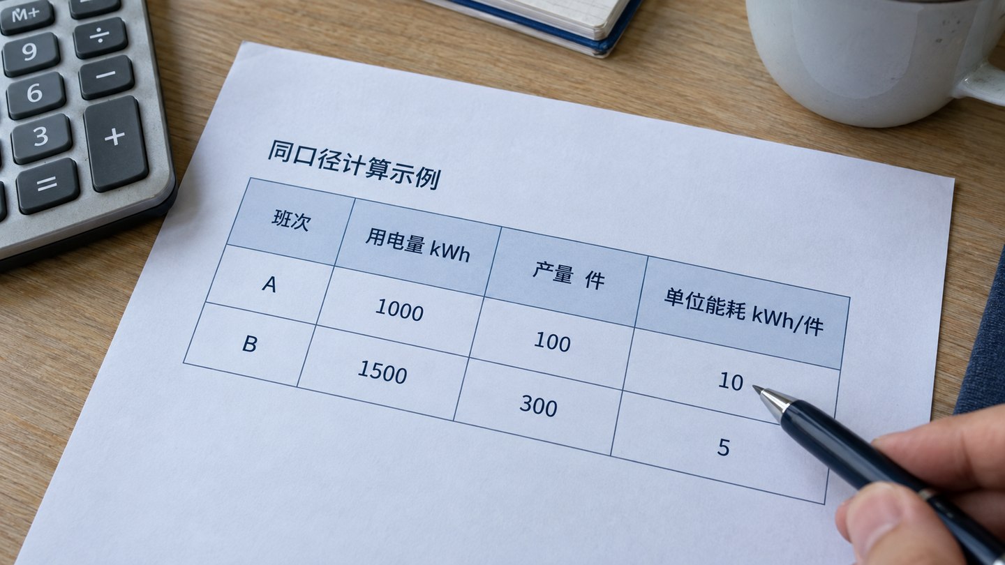
The critical issue is the calculation definition, not the chart. Decide at the start whether the denominator uses daily output, monthly output or accepted finished goods.
Many enterprises need the cockpit for timely detection, not just reporting. Operations teams may need to spot excessive peaks, sudden consumption increases, equipment faults or circuit issues. Typical pages include load curves, live power, limit alarms, alarm duration and responsible equipment.
Without exception data, the page can become a static report that people stop checking.
Where a project covers air compressors, cooling plants, boilers, pump groups, lighting, HVAC or charging equipment, a dedicated efficiency page can show runtime, load rate, start-stop count, COP, fault count and before-and-after retrofit comparisons.
This helps explain consumption changes and supports later review of upgrades and management reporting.
The obstacles are often incomplete meter points, unmapped circuit relationships, inconsistent definitions across systems or unreliable historical data. Ambitious projects may eventually stall on basic questions: where does each table come from, how is each field calculated and how often does it update?
First define the main sites and important consumption categories clearly, then extend to more buildings, workshops or equipment.
Ask four things: Can it map meters, circuits and equipment? Can it connect business and energy metrics? Can it support private deployment and long-term operations? Will it hand over field definitions, point lists and acceptance materials?
Start with data visualization dashboard development services to define the build scope; use the energy and carbon monitoring dashboard solution to organize metrics; then see the water-storage and energy-storage integrated monitoring platform case for process, dispatch and efficiency page organization. That case illustrates a solution and interface structure, not a claim of delivery outcomes for a particular customer. Before implementation, also use the data and API sample preparation checklist.
Energy projects often overlap with park operations, factory scenarios and acceptance preparation.
Plan factory energy alongside production, equipment and quality pages.
Add spatial, equipment and management views to park energy projects.
Use this before launch to check definitions, permissions, deployment documents and handover.