What Data Should an Enterprise Prepare Before Building a Digital Twin Factory?
Clarifies the preparation scope for production, equipment, quality, energy and APIs before launch.
Summary: A smart factory dashboard should do more than display a few charts. It should bring production, equipment, quality, energy use, work orders and delivery into a coherent view. A useful screen helps managers and shop-floor teams quickly see what is normal, what is not and what needs action.
The home page commonly shows today’s output, plan completion, active production lines, equipment online rate, open exception work orders, quality alarms and delivery status. It should help the factory lead judge whether today’s production pace is stable, rather than showing every detail.
For a business with multiple workshops, lines or plants, offer a plant or workshop switch. Putting all data on one page can look comprehensive while making decisions harder.
Common modules cover equipment status, downtime reasons, utilization, line pace, current work orders and operating efficiency. Even when called a production dashboard, the questions people often check first are which line is slowing down, which machine stopped and for how long.
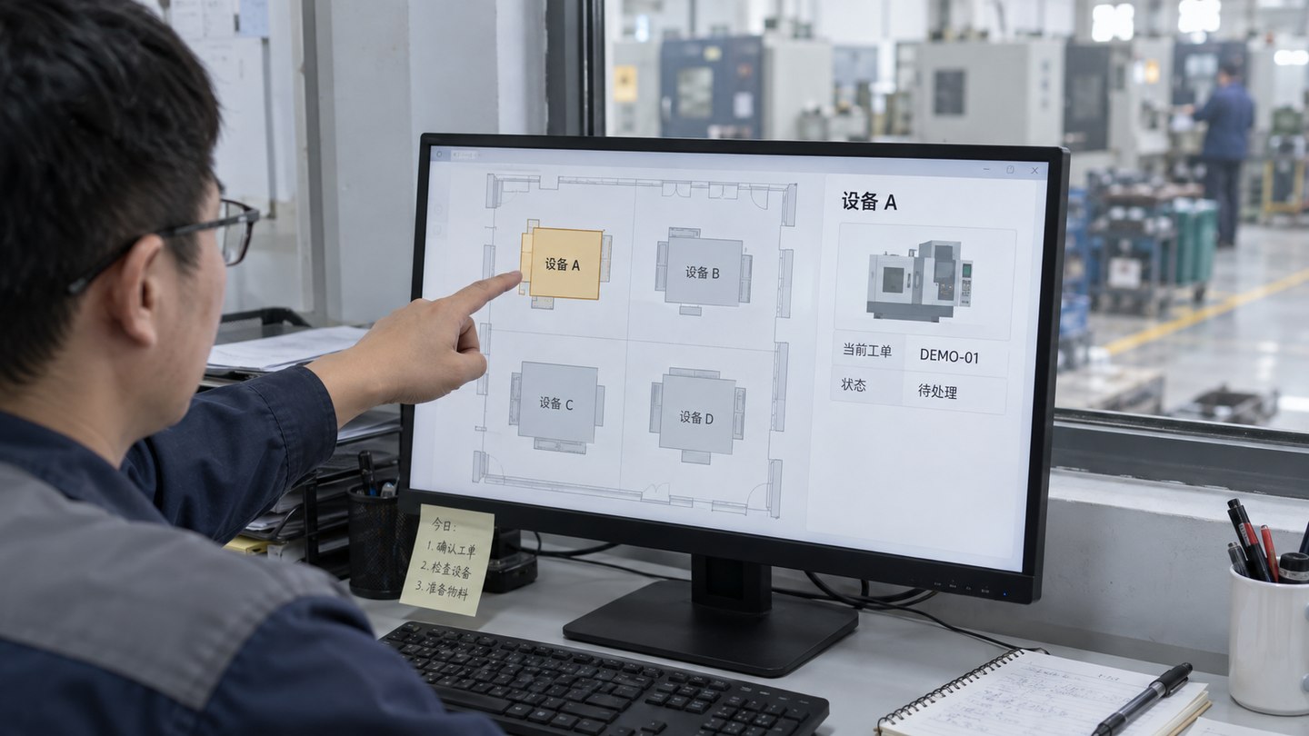
If equipment comes from multiple manufacturers or systems, confirm collection methods, field definitions and refresh rates before building. Otherwise, screen design may progress while integration stalls.
Quality data may include defect rate, rework rate, defect distribution, inspection results, batch traceability and issue work orders. It relates to production but follows a different logic, so a dedicated quality page is often more useful than adding everything to the home page.
For external reporting or internal review, that quality view can be more valuable than elaborate animation because it shows where variation enters the process.
Another common focus is electricity, water, gas and steam trends, alongside equipment faults, limit alarms and work-order status. Compare energy use by workshop, line, shift and time period to support later energy analysis and equipment improvement.
Do not reduce the alarm module to a red dot. Connect each alarm to an owner, duration, handling status and equipment so the dashboard supports maintenance work as well as display.
For a management cockpit, a four-level structure often works: a production overview; workshop or line details; focused pages for quality, energy and equipment maintenance; and an alarm-to-work-order closure view. Leaders can see the overview while operators can reach the details.
A showroom-oriented project may emphasize an aerial plant view, line layout, highlights and live displays. An operations-oriented project should put equipment status, work-order progress, shift efficiency and exception handling first.
The main issue is often fragmented systems rather than page design. MES, ERP, WMS, SCADA, equipment platforms and manual reports may use different fields and update schedules. Without deciding what needs live data, daily totals or a temporary static view, the dashboard can become too broad to deliver efficiently.
A steadier approach is to start with the core overview and one or two focused pages, validate the APIs, definitions and page structure, and expand from there.
Ask four things: Can it define boundaries between equipment and business-system data? Has it handled mixed workshop, line, quality and energy scenarios? Can it support private deployment and on-site integration? Will it deliver field definitions, account permissions and acceptance materials?
Related solution: Smart Factory Data Visualization Dashboard Solution. Related case: Smart Factory Production Monitoring Dashboard Case.
Factory projects should align data readiness, energy metrics and provider capabilities.
Clarifies the preparation scope for production, equipment, quality, energy and APIs before launch.
Assess integration, handover and maintenance capability for a factory project.
Define energy metrics, metering boundaries and page structure together.